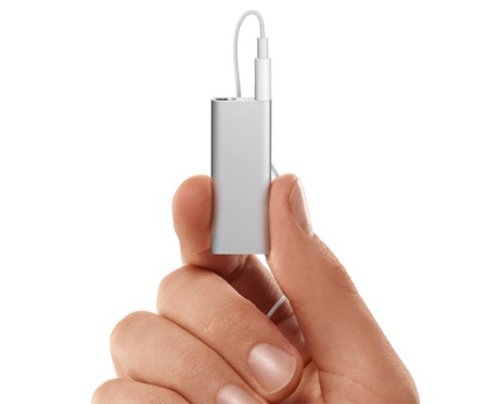
There are a number of things wrong with the new Shuffle:
- Proprietary headphones. Apple has done this in the past and nobody likes it. Aside from Apple's headphones being not that good, use of proprietary headphones adds another failure point. Headphones break all the time. So you're stuck paying Apple more money. Or...
- Pay for buttons. It's true. Apple has finally figured out a way to make you pay for a button. Not directly, of course. That would be like admitting they're wrong or greedy. Instead, they expect a bunch of accessories manufacturers to fill the void by offering button adaptors so you can use the new Shuffle with your headphones of choice. For those who don't know, Apple collects a fee (and in some cases, a percentage) from these accessory vendors, so Apple is effectively making money selling button adaptors.
- Speech is tech for tech's sake. I haven't heard the speech synthesis feature yet yet. But I find it difficult to believe it's going to accurately pronounce all the names, titles, genres, and so forth. Speech synthesis in an MP3 player is a clever idea. To my knowledge, nobody's done it yet. I'm sure Apple has patented it and is going to continue to talk about how innovative their tech is. But having the machine tell you what it's about to play is not much more helpful than you just listening to what's playing. I can identify 90% of the music in my giant collection within the first second. It's certainly not going to be any faster than just listening. Speech synthesis is nowhere near as efficient as even a 1-line screen for things like browsing, searching through the content on the device, seeking within a track, and other standard MP3 player functions. Mostly, the speech synthesis lets Apple continue to claim their products are different, new, etc.
 The previous iPod Shuffle (the ones with the clip and the buttons on the face) were as close to a perfect minimalist player as one could get. Nice weight. Integrated clip. Well-placed buttons. Small enough to be unobtrusive but large enough to not have to fumble with any of the switches. Look and feel keep it within the iPod family.
Some may take issue with the lack of a screen. I respond that it isn't necessary for the player's intended use case, price, capacity and overall design.
I'm also of the opinion that the original iPod Shuffle (the "stick of gum") was the best of the lot. Yes, it was larger than either of the tiny shuffles that followed. But it wins because it had the USB plug integrated into the body, so no cable was required. All you needed was the player itself.
The new Shuffles (and, unfortunately, the "clip" design) require not just a cable, but a whole custom dock. I believe this is also a commercial decision rather than a straight design or usability one. The size of both new Shuffles would enable a simple mini-USB jack. Apple would rather lock you into their world and platform and require you to carry more stuff around. More to lose, more to break.
Apple doesn't always get it right - the iPod generation with 4 buttons across the top is one example. They backed off of that pretty quickly. Same with the famous "cube" Mac. I suspect the same thing will happen with the new Shuffle. They'll come back to a design with buttons or at least one button or a touch screen or some new gimmick. Presumably You could shrink it down until it's not much bigger than a headphone jack. I just hope they don't build it right into the headphones.
In the meantime, I'm sticking with my Sansa Clip, which I think is even better than the previous iPod Shuffle. Except the Clip looks and feels like a cheap toy, whereas the Shuffle feels like a quality product. That's OK. I'm not looking at it - I'm listening to it. It works with Rhapsody and it sounds great.
Update (03/16/2009): It turns out that older inline iPod/iPhone headphone controls won't work with the new Shuffle. There may be DRM hardware involved as well.

No comments:
Post a Comment