Showing posts with label design. Show all posts

Monday, August 29, 2011

Steve Jobs, Inconsequential Details, and Bass Players

In the wake of Steve Jobs' resignation from Apple this past week, hagiographic posts churned and bubbled. One of the most popular was a story by Vic Gundotra, about how Jobs called him to discuss the Google logo on the iPhone, specifically the gradient in the yellow "o". It wasn't right, and he wanted it fixed.

People have been citing this as an example of how great Jobs was/is, noting his miraculous attention to detail.

I completely disagree. Jobs had many fine moments. This was not one of them.

This was a completely inconsequential detail. I doubt most people, seeing the two images side by side, could even tell the difference. And yet this top executive felt the need to spend time with another top executive to discuss and resolve the situation. On a Sunday morning.

Jobs has an army of some of the best visual design folks on the planet. They've not only gone to school for precisely this thing, they've executed design in the field. Google's design team isn't as good, but they're no slouches (and they're getting better).

Steve Jobs, on the other hand, is a guy who tucks his turtlenecks into his rather unflattering jeans, and wears running shoes with them (and not cool running shoes, either). His personal clothing aesthetic could perhaps be described as "successful sysadmin who once went shopping with a girlfriend". 

So Jobs or professional designers: who's going to make the better design choice?

One makes many aesthetic decisions designing products or making art. Most of them are arbitrary, and collectively they create the overall feel of the thing. If you believe the reporting and hype, Apple's products are basically the result of Steve Jobs' personal aesthetic. There's nothing wrong with that.

Even if you think Jobs made the better choice and had the right to, imagine how his designers felt. Why are they even there? (And yes, I understand it's entirely possible one of them noted this issue and passed it up to The Steve so he could pass it over to Vic and get approval - you can't just arbitrarily change a logo asset for a company like Google, but I'm assuming the story went down as people are choosing to interpret it).

In the big picture, this detail was inconsequential. CEOs are supposed to stay focused on the big picture, and leave the details to the folks passionate and expert in implementing the details.

 Far more important were the many other design decisions made - the size of the device, the weight, the screen resolution, how the system looks in general. Jobs (and more importantly, his toiling, faceless legions of workers) should be lauded for their attention to detail and understanding how important some of those things can be. If one has any doubts, go look at an Android phone or a (shudder) BlackBerry and see what lack of attention to detail looks like.

When you add someone to your band, you want them to bring their aesthetic and contribute. As I like to say, if I want you to play bass in my band, I want you to play what you think are good bass parts. If I'm standing in front of you constantly saying "no, not that note, play it exactly like this", I'm not looking for a collaborator. I'm looking for a robot (and should have a robot playing the part).

Looking at Jobs' take on this, he's got designers and he's not using them. He either hired the wrong people (they couldn't do the work to the level of satisfaction required) or he didn't empower them (he didn't let them do the work they were hired for). Neither of those speaks well of his decisions!

It's important to call out when design overrides are worthwhile or not. Looking back to this post, I'd cite Vic's story not as an example of Jobs' brilliance, but rather an example of how most CXO-level executives focus on the wrong things and take away the wrong lessons from Jobs' leadership.

Over the last few days, I expect many designers have received emails from their CEOs critiquing their visual design. Sorry to hear that, guys. Maybe you can call Vic Gundotra and get his advice on what to do.

Friday, December 17, 2010

Who's Wrecking Your Product?

It really does only take one person to wreck a product.

Sometimes they wreck it before it's even started. Sometimes they wreck it while it's being made. Sometimes they wreck it after it's done.

Creating a product requires many things:
  • Clear vision - this includes what need it should address, why it's being built, for whom, and what the timeline should be. 
  • Realistic goals - this includes the budget and resourcing as well as the expected feature set and benefits to the company bottom line
  • Carefully balanced trade-offs between all of the competing elements
  • Discipline 
Ultimately, the product manager is responsible for all of the above. But in many companies, product managers lack the authority to enforce those items. In others, the key decisions are either made or overridden by senior management.
    Steve Jobs Wrecked Your Product
    "Boom! I just wrecked your product!"
    Why blame The Steve? He's legendarily, heavily, deeply involved in nearly all aspects of product creation for Apple. Mr. Jobs really does make many, many decisions. And he's frequently, annoyingly "right", in the sense that Apple's products have sold extremely well since his return from exile.

    Many books have been written about Steve Jobs and Apple, dissecting them both and seeking the reason for their success. I think in both cases it comes down to one thing: discipline.

    Apple seems to realize the value of restraint. Less is more, especially in software. They initially launch with a sometimes laughably small number of features...but they all work, and work well. They slowly add high-quality features over time. This approach is very similar to the "kaizen" process that Toyota uses. Developing with discipline beats rushing out a feature-complete-but-buggy 1.0 and then trying to patch it.

    Steve Jobs is very good at helping decide what to leave out. He understands that good products are narratives (like, say, Pixar films). They have a central theme which must be supported and reinforced.

    Steve Jobs has caused 2 major problems for everyone else, though. And both are the result of being blinded by surface and style rather than focusing on deeper critical thinking.

    Steve Jobs Wrecked Your Boss
    Nearly every high-level executive I can think of secretly (or not-so-secretly) wants to be Steve Jobs. They admire his panache, life story, fashion sense, reputation, and of course, massive success.

    Unfortunately for many, one of their takeaways from Steve Jobs is "I need to micromanage my product team". They insist on arbitrary product reviews with no clear next steps. They make changes without a strategic or tactical understanding, of the project goals. They don't stay informed about the product constantly, and rather like the Eye of Sauron, swing in to focus on it erratically and painfully.

    They change the central theme of the product. They move goalposts. They revoke previous decisions.

    Steve Jobs sets clear goals at the outset: Who's the ultimate decision maker? (he is, and he stays involved) What's the theme of the product? What are the resources? And so on.

    If your supervisors emulate the wrong aspects of Steve Jobs, you may be wrecked before you even start. Getting around bad management is a challenge for the best product managers. Sometimes it is clear that bad management will wreck your product. It's almost always better to ship even a flawed product than to bail out, however.

    So, misunderstanding leadership lessons from Steve Jobs. What else? How about misunderstanding design!

    The Cargo Cult of Steve (or, Your Company is Not Apple)
    I have a kitchen timer that looks like an original iPod. Because it was designed and made when iPods were popular. It is a terrible, terrible product. And it is obvious the company that made it wanted it to look like an iPod to cash in.

    While it is superficially similar to an iPod, in practice, it is the antithesis of what made the iPod popular. It takes a relatively simple product (a countdown timer) and turns it into something incredibly annoying and difficult to use.

    Reasons why it's terrible? Off the top of my head:
    • Button layout arbitrary and inappropriate for purpose
    • Buttons are too stiff
    • Inscrutable UI
    • Lack of attention to detail
    It feels awful to use.

    I don't know the folks who created this thing, but I can imagine the meetings where they decided (or perhaps the boss demanded) to adopt the visual language of the iPod without understanding the product thinking that led to that visual language. It is cargo cult thinking.

    Products get wrecked when companies decide to emulate other products' surface appearance without understanding the thinking that created that appearance in the first place.

    This is different from following "industry standards", "best practices", or even "trends". Those all have their place when they are conscious decisions made with intent.

    Copying Apple is a conscious decision, and the intent is clear - emulate success. But Apple's success (and design) come about because the company makes conscious decisions with intent.

    Another frequently cited example is the use of 3D buttons and glossy effects. Apple doesn't make buttons glossy and 3D just because they "look cool". They do it to make the buttons stand out clearly from the rest of the flat, matte interface. Many other OS widgets (Android, Windows 7 for example) use glossy and 3D effects in a gratuitous fashion, and frequently the shiny highlight makes text less legible.

    Design elements should never be gratuitous. If you're doing something for no other reason than "it looks cool", reconsider. That said, "looking cool" can add value provided you're not interfering with the rest of your product functionality.

    Your boss might misunderstand Steve Jobs. Don't allow yourself or your team to misunderstand Apple and design in general. Make conscious decisions with intent. Think about what you are trying to accomplish and what would work best.

    Let form follow function. Or at least make sure the form is informed by function, or you know what your trade-offs are. Innovative and exciting designs frequently spring from re-focusing on what the customer is actually trying to do, rather than merely sprucing up existing design conventions.

    Don't let Steve Jobs wreck your product! Be disciplined. Make your own choices with intent.

    Up next: Your Team!

    Thursday, December 02, 2010

    Why Products Really Suck, Part 1

    Image from: http://bit.ly/dM9CtS
    I recently read this rather glib and uninformative article about "Why Products Suck". It got me thinking. I've made and shipped a number of products. Some won awards. Some were terrible.

    I've definitely learned a few things, and I can definitely provide more insight than the above-mentioned article's key points, which were:
    1. It only takes one person to make your product suck.
    2. Nobody ever got fired for sucking.
    3. It’s easier to suck more than suck less.
    4. There are more ways to suck than to not suck.
    5. Customers demand sucky products.
    So I'll be doing a series of articles on making good products. First, let's look at what's wrong with this article.


    First point. The author claims "It only takes one person to make your product suck." There are a number of interesting and correct directions he could take this statement. But his actual point is that you need consensus among your "team" that your primary goal should be "not sucking".

    It is true that it only takes one person to wreck a product. There's a New Yorker cartoon I used to have taped to my wall that showed a guy at a desk writing on something his subordinate handed him, saying "I just need to make one change that will ruin all the work you've done."

    Frequently, that person is not who you expect them to be, and they will be the subject of a future article.

    I will also discuss the pros and cons of team consensus.

    Second point. "Nobody ever got fired for sucking". This is sadly true, however the point as presented in the article is rather weak. The author is basically saying "you should fire bad people" without clarifying the differences between:
    • appropriate and inappropriate risk
    • initiative and running wild
    • genuine accidents/mistakes and negligence
    Good teams and good managers not only get enough rope, they sometimes get tangled up in it. Not every risk pays out, and some risks lose big. That's why they're risky. Start-ups take bigger risks than established companies, and new products take bigger risks than established ones. They have to in order to survive.

    I'll discuss risk and failure as well.

    Third point. "It's easier to suck more than suck less". His somewhat dippy phrasing covers the best point he makes in the article: Serve the right customer. Don't be so desperate for customers you build features that aren't core. You'll attract the wrong customers and then be beholden to them with even greater costs for getting back on track.

    There will be a nice long article about discipline in product design.

    Fourth point. "There are more ways to suck than not to suck." His point here is "you need to be careful with your choices and define your product clearly before you start development". This is true, but many of the examples he cites are not relevant to that point at all. There are tactical mistakes one can make. Choosing the wrong user interface widget isn't one. Good UI designers don't really have choices with too many questions if the product is well defined - in those cases, the best (or at least better) tactical choices are fairly obvious.

    Strategic choices are much more difficult and much more important, and frequently glossed over in both theory and practice. I firmly believe that making great products is not particularly difficult if the environment is good and the team is competent. I'll cover that as well.

    Fifth point. "Customers demand sucky products." This is a rather provocative statement, given the "customer is always right" attitude that dominates. The author's main point is , but he follows it up with a poor, or at least insufficiently specific suggestion:
    Trust your instincts and the tiny set of users who use you, and resist advice from the billions of people who don’t.
    Good product designers do have instincts, but those instincts are informed by experience, best practices, and lots of research.

    Your current users are frequently the last people you want to be talking to about how to evolve your product. In the early stages of a product, your users are likely to be unrepresentative of the larger user demographic, unavailable in sufficient numbers to float your whole business model on, and highly demanding.

    For more mature products, your users are again likely to be unrepresentative of the next tranche of users you hope to attract, and will be used to how your product works. They are likely to demand minor iterations or evolutions of features.

    The short answer is "talk to people who are like the users you want to have", and the long answer will be coming in a new post soon.

    Up Next: Who's wrecking your product? (Answer: Steve Jobs. Seriously).

    Tuesday, September 14, 2010

    Apple Shuffles On

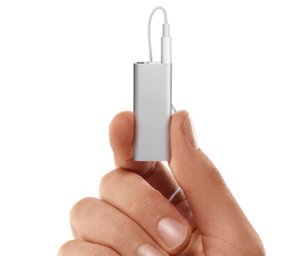
    As predicted, Apple has abandoned their button-free iPod Shuffle design for a return to the "ring button" layout of the very popular clip-style iPod Shuffle. It's a much better design.
    The "new" iPod Shuffle, now in many colors. (image courtesy of Apple)

    Overall, it's still expensive and feature-poor compared to the Sansa Clip, which offers more memory, an FM tuner, and a screen, but it is a much nicer-feeling product. The Sansa Clip still feels like a toy, as do most non-Apple MP3 players.

    Ultimately, the new iPod Shuffle is a mature, solid product and in many ways, a perfect design.

    The new Nano is a bit more baffling. I suspect it's just marking time and covering a price point for Apple, as they can't yet get iPod Touches down to a cheap enough price point, can't charge more for the Shuffle, and are unwilling to leave a gap in their iPod price line for a competitor to fill.

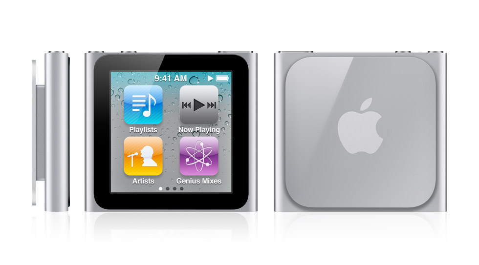
    The current iteration of the iPod Nano (image courtesy of Apple)
    As a technological achievement I suppose the new Nano is rather nice, but as a product, it's sorta goofy.

    I did somewhat anticipate their grafting a touchscreen onto such a tiny form factor, but after the addition of the camera to the Nano in the previous round of revisions, I expected it to be the Shuffle that got it, rather than the Nano.

    That would have allowed Apple to claim they were still moving forward on the Shuffle design rather than "retreating" to a previous one, and would have left the door open for more advancements in Nano land (the lack of a camera on the new one is arguably a big step backwards).

    In its current design, the Nano is intended to be clipped onto one's clothing, like the Shuffle. But in practice, this means both the display and the controls for the unit are facing out and away from the user, so the user has to look down at their clothes and/or pull the Nano towards themselves to see and manipulate it. Because the screen is the control surface, and because it is so tiny, it is very difficult to hold the Nano while controlling it, and while you are pushing its surface, much of the screen is obscured.

    Contrast that with the "candy bar" Nano design. Its hardware controls and orientation allowed for "blind" operation - you could skip tracks or pause in your pocket, without looking at the screen. Because it was "candy bar" style and size, it afforded gripping in the hand while looking at the screen, without obstructing the screen.

    The new Nanos also don't allow users to install or run apps (and I'm glad about that, because otherwise there would be yet another Apple mobile configuration to design for), but their visual interface design picks up many of the cues of Apple's higher-end products, including fancy animations, a pivoting display, "multi-touch", and more. Much of this is simply gratuitous, but goes a long way to justifying the pricing in consumer's minds.

    I find the much-vaunted "multi-touch" control silly and inferior to the simple elegance of the click wheel for something like the Nano. The Nano itself is hard to pin down - it's too fancy and fiddly for the gym, the Shuffle being far superior for that.

    Eventually, I expect Apple to merge these two products - their design framing suggests they're headed this way. Again, I suspect it's a matter of covering price points while they wait for component and design costs to come down, for all aspects of the product line. When they do, I hope they manage to keep more of the ring button design and less of the touchscreen, but past behavior sadly indicates otherwise.

    In the meantime, Apple manages to monetize its quirky design choices and its decisions to emphasize the "feel" of products as much as their actual features.

    Most people, even hardcore audiophiles, are better off using a smartphone or iPod Touch-type device as a music player. If you need a portable for the gym, I'd still recommend the Sansa Clip over the Shuffle unless you're an all-Mac person. The Sansa Clip may feel like a toy, but that minimizes the pain you feel when you drop it or lose it.

    Thursday, March 12, 2009

    Apple and the New Shuffle: Buttons Cost Extra [Updated]

    The new iPod Shuffle is an example of taking ideas too far. Driven by a desire to remove all controls (in particular, buttons) from their products and a business need to churn the product, Apple has produced a bad design that borders on the ridiculous.

    There are a number of things wrong with the new Shuffle:
    • Proprietary headphones. Apple has done this in the past and nobody likes it. Aside from Apple's headphones being not that good, use of proprietary headphones adds another failure point. Headphones break all the time. So you're stuck paying Apple more money. Or...
    • Pay for buttons. It's true. Apple has finally figured out a way to make you pay for a button. Not directly, of course. That would be like admitting they're wrong or greedy. Instead, they expect a bunch of accessories manufacturers to fill the void by offering button adaptors so you can use the new Shuffle with your headphones of choice. For those who don't know, Apple collects a fee (and in some cases, a percentage) from these accessory vendors, so Apple is effectively making money selling button adaptors.
    • Speech is tech for tech's sake. I haven't heard the speech synthesis feature yet yet. But I find it difficult to believe it's going to accurately pronounce all the names, titles, genres, and so forth. Speech synthesis in an MP3 player is a clever idea. To my knowledge, nobody's done it yet. I'm sure Apple has patented it and is going to continue to talk about how innovative their tech is. But having the machine tell you what it's about to play is not much more helpful than you just listening to what's playing. I can identify 90% of the music in my giant collection within the first second. It's certainly not going to be any faster than just listening. Speech synthesis is nowhere near as efficient as even a 1-line screen for things like browsing, searching through the content on the device, seeking within a track, and other standard MP3 player functions. Mostly, the speech synthesis lets Apple continue to claim their products are different, new, etc.

    The previous iPod Shuffle (the ones with the clip and the buttons on the face) were as close to a perfect minimalist player as one could get. Nice weight. Integrated clip. Well-placed buttons. Small enough to be unobtrusive but large enough to not have to fumble with any of the switches. Look and feel keep it within the iPod family.

    Some may take issue with the lack of a screen. I respond that it isn't necessary for the player's intended use case, price, capacity and overall design.

    I'm also of the opinion that the original iPod Shuffle (the "stick of gum") was the best of the lot. Yes, it was larger than either of the tiny shuffles that followed. But it wins because it had the USB plug integrated into the body, so no cable was required. All you needed was the player itself.

    The new Shuffles (and, unfortunately, the "clip" design) require not just a cable, but a whole custom dock. I believe this is also a commercial decision rather than a straight design or usability one. The size of both new Shuffles would enable a simple mini-USB jack. Apple would rather lock you into their world and platform and require you to carry more stuff around. More to lose, more to break.

    Apple doesn't always get it right - the iPod generation with 4 buttons across the top is one example. They backed off of that pretty quickly. Same with the famous "cube" Mac. I suspect the same thing will happen with the new Shuffle. They'll come back to a design with buttons or at least one button or a touch screen or some new gimmick. Presumably You could shrink it down until it's not much bigger than a headphone jack. I just hope they don't build it right into the headphones.

    In the meantime, I'm sticking with my Sansa Clip, which I think is even better than the previous iPod Shuffle. Except the Clip looks and feels like a cheap toy, whereas the Shuffle feels like a quality product. That's OK. I'm not looking at it - I'm listening to it. It works with Rhapsody and it sounds great.

    Update (03/16/2009): It turns out that older inline iPod/iPhone headphone controls won't work with the new Shuffle. There may be DRM hardware involved as well.

    Monday, January 28, 2008

    Wabi-Sabi and Product Design


    There are many examples far worse than this.
    I find it funny that people will spend hundreds of dollars on a fancy piece of elegantly designed consumer electronics like the iPod or iPhone and then stick them into a cheap and hideous case designed to "protect" it.

    It reminds me of those living rooms some of my friends' families had with nice furniture trapped under plastic shrouds.

    What's the point? They love the object's beauty so much they'd rather hide it or obliterate it completely lest it get a single scratch? These things aren't supposed to stay perfect, flawless, beautiful forever (just like you and me). The expected consumer lifetime for most PDAs, mobile phones and MP3 players is 18 months. You really can't live with a scratch that long?

    I believe Apple puts those shiny chrome backs on the things to force people to fetishize them, constantly trying to rub off their own fingerprints. Sisyphean in a way. All that attention - it's like washing your car every day.

    Zune has done a nice job of giving their players surfaces that still feel and look nice but don't require you to carry a bottle of Brasso everywhere you go.

    There's a Japanese concept known as wabi-sabi. There aren't direct analogues in English, but the general idea is there is a dignity and beauty in things that are aged and worn, and that impermanence and transience are good and right.

    Would you rather have a shiny brand new guitar or a vintage Strat from the 50s? Most people, not just guitar junkies, prefer older, worn instruments. Wabi-sabi.

    Fender and other manufacturers have realized there's big money to be made in delivering new guitars that look (and to a lesser degree, feel) like they're old.


    As a guitar player and appreciator of wabi-sabi myself, I cannot deny that I think older guitars look and play better than new ones. I even think the faux-old ones look better than new. But I could never buy an ersatz old guitar. That's cheating, and even cheesy. Part of the wabi-sabi aesthetic is the implication of the wear - this thing has been around, it's been used, it has a history.

    The Steampunk movement is operating in this space coincidentally, if not explicitly. And one of the reasons people liked the design in Star Wars so much was how everything in the world felt used and old, as opposed to the typical "out of the packaging" look of most other science fiction.

    I wish more designers would take advantage of wabi-sabi. What would a car that came "relic"ed look like? Why don't they? (answer: because the car companies have a lot invested in you wanting brand new shiny cars instead of old ones - and there are way more old cars than new available. The reverse is true for guitars).

    Consumer electronics would be great like this. I would love an MP3 player that was slowly rusting, with big chunky knobs. Or a PDA with a leather back that wore and aged like a Filofax or notebook. A home stereo with dents.

    What about a PC application that "aged", wore, and picked up dings and marks? What would that be like?